Y
yahoo.com
CRO Recommendations — August 2026
CRO Page Prioritization

Where the Conversion
Leaks Are

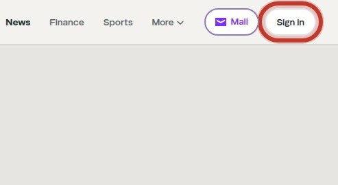
The homepage's lack of a clear value proposition and primary CTA, combined with multiple competing CTAs and a rotating hero, dilutes user focus and prevents visitors from understanding Yahoo's core offering, thereby bleeding conversion potential. The most valuable conversion mechanism on this site is personalization (sign-in), but it is buried among other CTAs and not clearly communicated, so users don't see the benefit of signing in.

7 analysts 6 pages 10 findings 4-week roadmap →
C
71 / 100 overall
Per-surface grade — longer bar means more conversion risk found on that surface
Homepage
F
Navigation
C
Sports Article Page
B
Trust & Proof
B
2.6 – 11.8
orders per 1,000 visitors
1
Verified by measurement
3
Urgent
Blocking or misrepresenting the primary path.
0
Shippable this week
Low-effort changes — start here.
The grade reflects the findings that survived this run’s integrity checks — it is a snapshot of this audit, not a fixed property of the site.
Before & After — click any card for evidence, math and the dev spec
Current
Recommended
1
Urgent

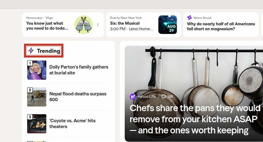
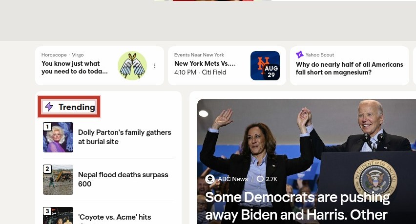
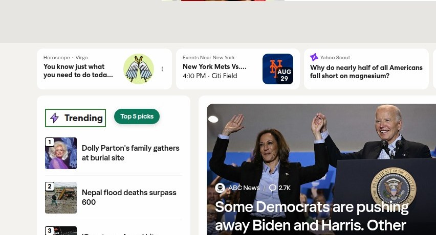
No H1, no value prop

The homepage lacks an H1 and any clear value proposition, leaving visitors without a reason to engage or convert.

High effort
Full analysis →
Current
Recommended

Homepage

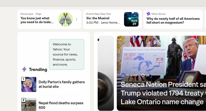
Welcome to Yahoo

Your daily essentials, all in one place.

Sign in to personalize your feed

Secondary: Weather, Horoscope, Events, Sports Scores, Yahoo Scout

✓ Single CTAOne clear action guides users to sign in.
2
Urgent

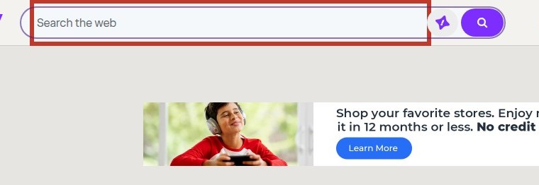
Multiple competing CTAs

The homepage presents multiple competing primary CTAs without a clear primary action, diluting user focus and potentially reducing engagemen

High effort
Full analysis →
Current
Recommended
3
Urgent

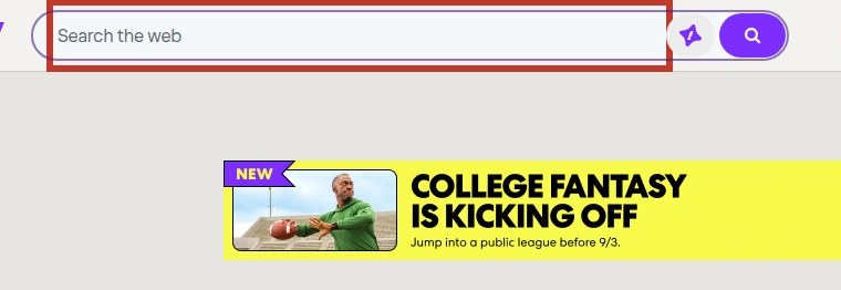
Rotating hero without focus

The homepage's hero area is a rotating carousel of unrelated content with no single clear message, diluting the visitor's attention and inte

High effort
Full analysis →
Current
Recommended
4
High

Unclear pricing signals

The homepage displays various prices without context, potentially confusing users about what is being sold and creating hidden cost percepti

High effort
Full analysis →
Current
Recommended
5
High

No pricing page link

The navigation lacks any link to a pricing page, making it difficult for users to find pricing information for Yahoo's paid services.
Medium effort
Full analysis →
Current
Recommended
6
High

Choice overload in nav

The homepage navigation presents a high number of links and multiple skip links, potentially overwhelming users and diluting focus on primar

Medium effort
Full analysis →